Digital Clock Design for The Walt Disney Company’s 100th Anniversary

I was tasked with designing a digital clock for Disneyland’s homepage that would count the days until start of the Walt Disney Company’s 100th anniversary celebration.
My challenge was in figuring out how to encapsulate the company’s diverse history within a single visual and in merging art deco elements with a contemporary anniversary style guide. This also had to be done within existing technology parameters.
Role
Illustrator/Designer
Software
Figma
Adobe Illustrator
Branding
The official colors of the 100th anniversary celebration were purple and platinum as well as a variety of platinum gradients.
Below is a small sampling.

Another part of the 100th anniversary branding was a facet system. It was meant to showcase multiple intellectual properties at once, with characters staying within the bounds of their triangular windows.

Research & Inspiration
Early creative direction for the clock included incorporating an art deco influence. Some of my inspiration was taken from architecture and signage within the Disney parks themselves. A few samples are below.


Design Process & Evolution
The first iterations used the shape of Disneyland’s welcome plaque as the clock shape. They also included the starburst element seen in some of the park’s architecture. The third clock below was influenced by the Art Deco Society image shown above.


Second Pass
Feedback at this stage involved simplifying the clock shape and straightening it to eliminate the arch.

Round Three!
At this point the design began to pivot from some of the distinct art deco style design elements in favor of the faceted look. The idea is that various versions of Mickey from the past 100 years would animate/fade in and out. The options below also introduced an arched shape around the logo.
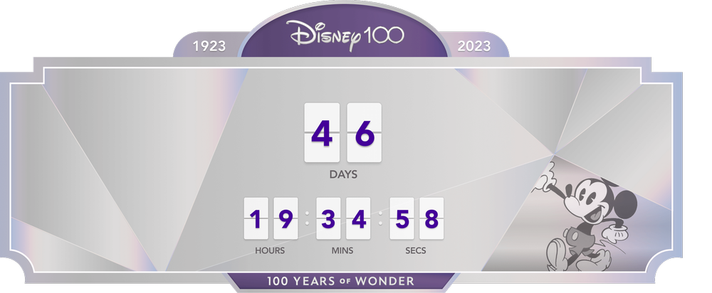
Final Design
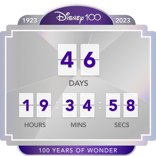
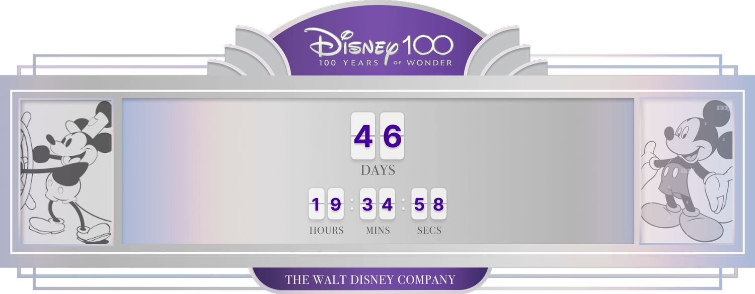
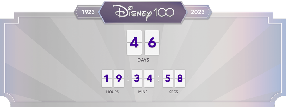
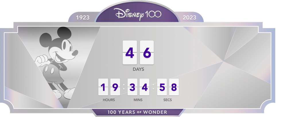
Below are the final desktop and mobile clock designs. The overall clock shape was changed one more time for this final iteration. These final designs reflect a light art deco influence while showcasing Disney’s 100th anniversary branding.
Several internal partners were involved in approving this creative including product leadership, the principal illustrator, and Disneyland marketing. Once approved, the designs lived for a year on both the Disneyland home page as well as a web page dedicated to the anniversary.