Digital Clock Design
The Walt Disney Company’s 100th Anniversary

Project Overview
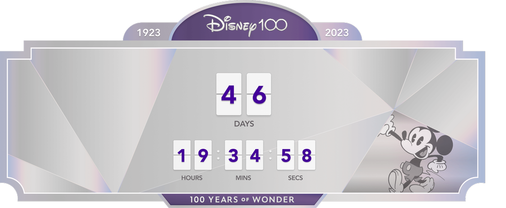
I designed and illustrated a digital clock for Disneyland’s homepage to mark the Walt Disney Company’s 100th anniversary. It lived on Disneyland’s home page as well as a web page dedicated to the celebration and counted down the days until the celebration began.
Problem
How do I encapsulate the company’s storied 100-year history in one graphic? How do I make that graphic reflect the milestone?
Solution
The final design blended art deco motifs with the 100th anniversary style guide.
Role & Software
Illustrator, Designer
Figma
Adobe Illustrator
Branding
The official colors of the 100th anniversary celebration were purple and platinum and a variety of platinum gradients. It also included a facet system, shown here.


Research & Inspiration
Early creative direction for the clock included an art deco influence. Some of my inspiration was taken from around the Disneyland Resort.


Design Process & Evolution
First Iterations


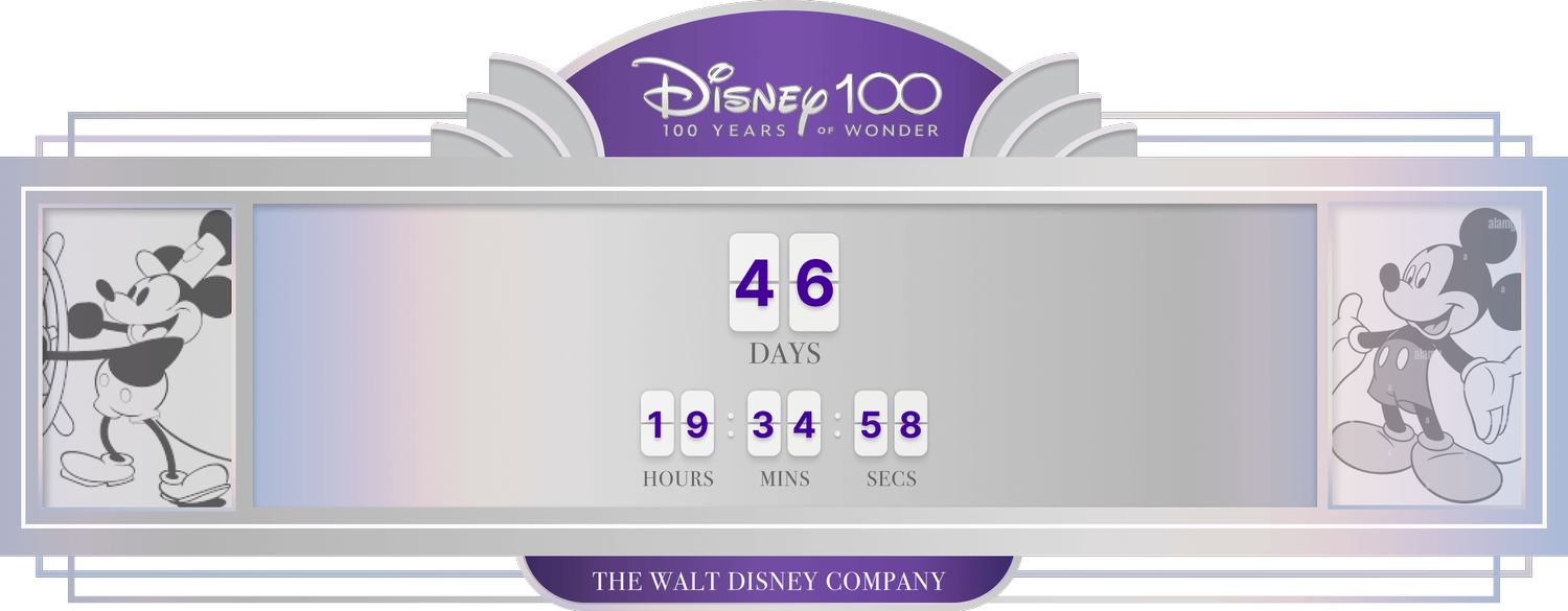
Second Pass
Feedback at this stage involved simplifying and straightening the clock shape.
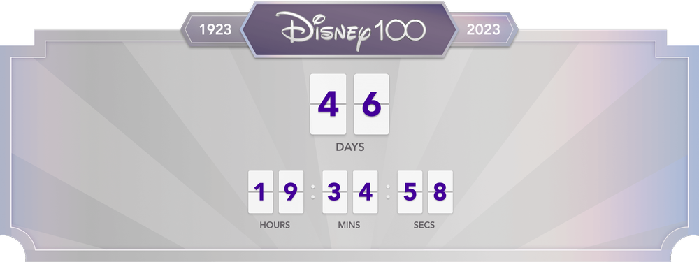

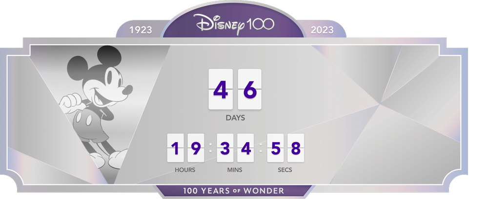
Third Iteration
At this point the design began to pivot from art deco to the more faceted look. Various versions of Mickey from the past 100 years would animate/fade in and out.
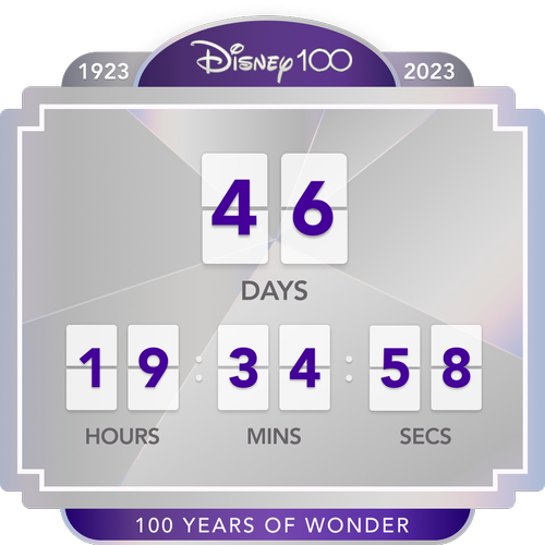
Final Design
The final design reflected a light art deco influence while showcasing Disney’s 100th anniversary branding.
The designs lived for a year on both the Disneyland home page and a web page about the anniversary celebration.