Web and App Design

Project Overview
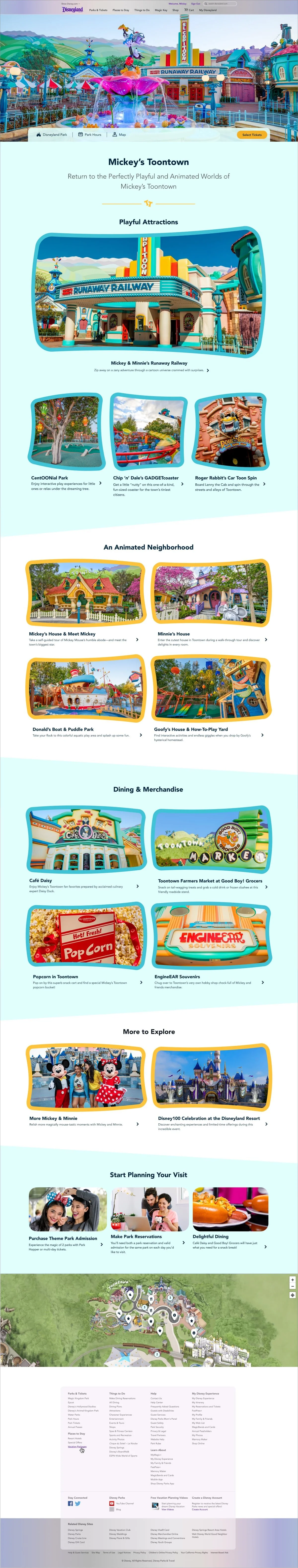
I provided visual design for a series of web pages and app screens to promote Disneyland’s Toontown. This project involved translating the playful look and feel of the physical land into the digital product space.
Helpful to Know
Toontown is an area of Disneyland park that recently reopened after a refresh and renovation. The new web page was meant to convey the spirit of Toontown and generate awareness and excitement among guests. Screens for the Disneyland app were also created to help guests get the most out of their visit to the new and improved area.
My Role
Visual Designer
Deliverables
Main web page
12 Supporting pages
App screens
Some Context
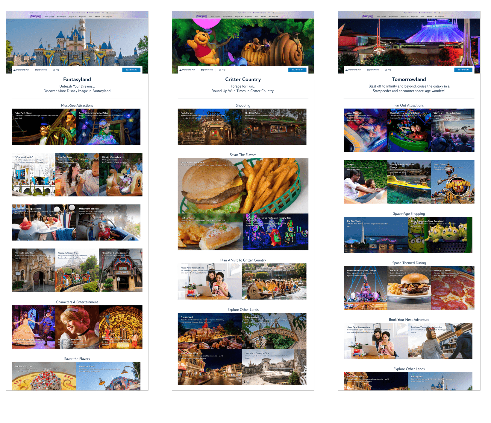
Below are a few similar pages from Disneyland.com which don’t contain customization. This is what the Toontown home page would have looked like without specialized theming.
The Design Process

Research & Inspiration
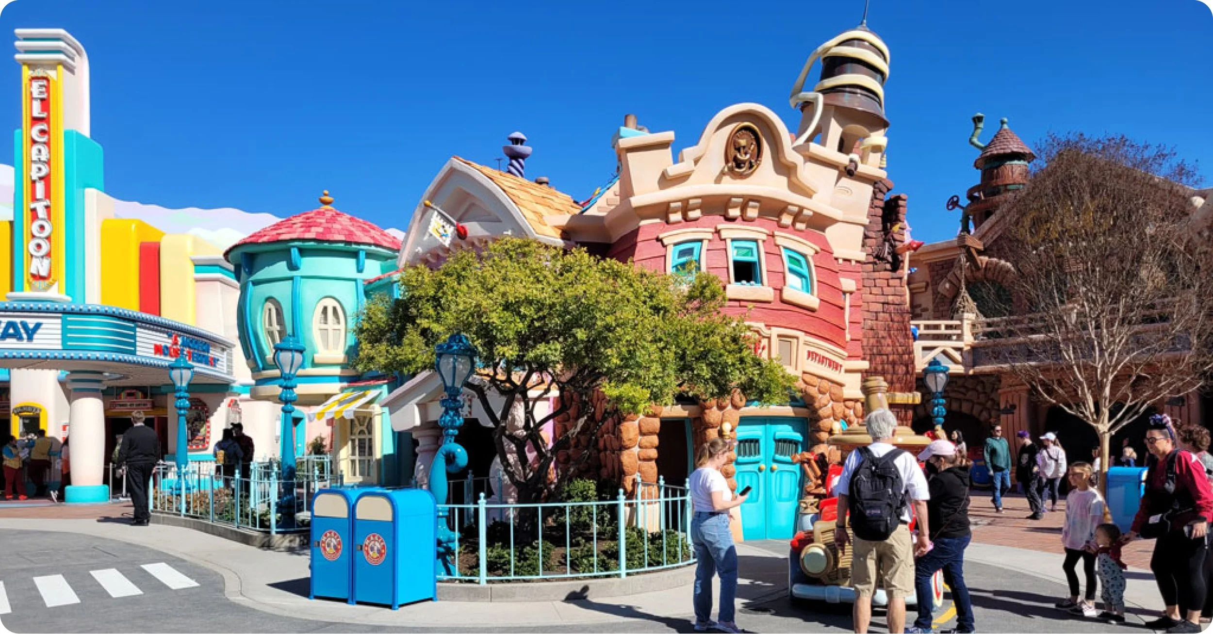
Photographs and artist’s renderings provided me with early design inspiration.


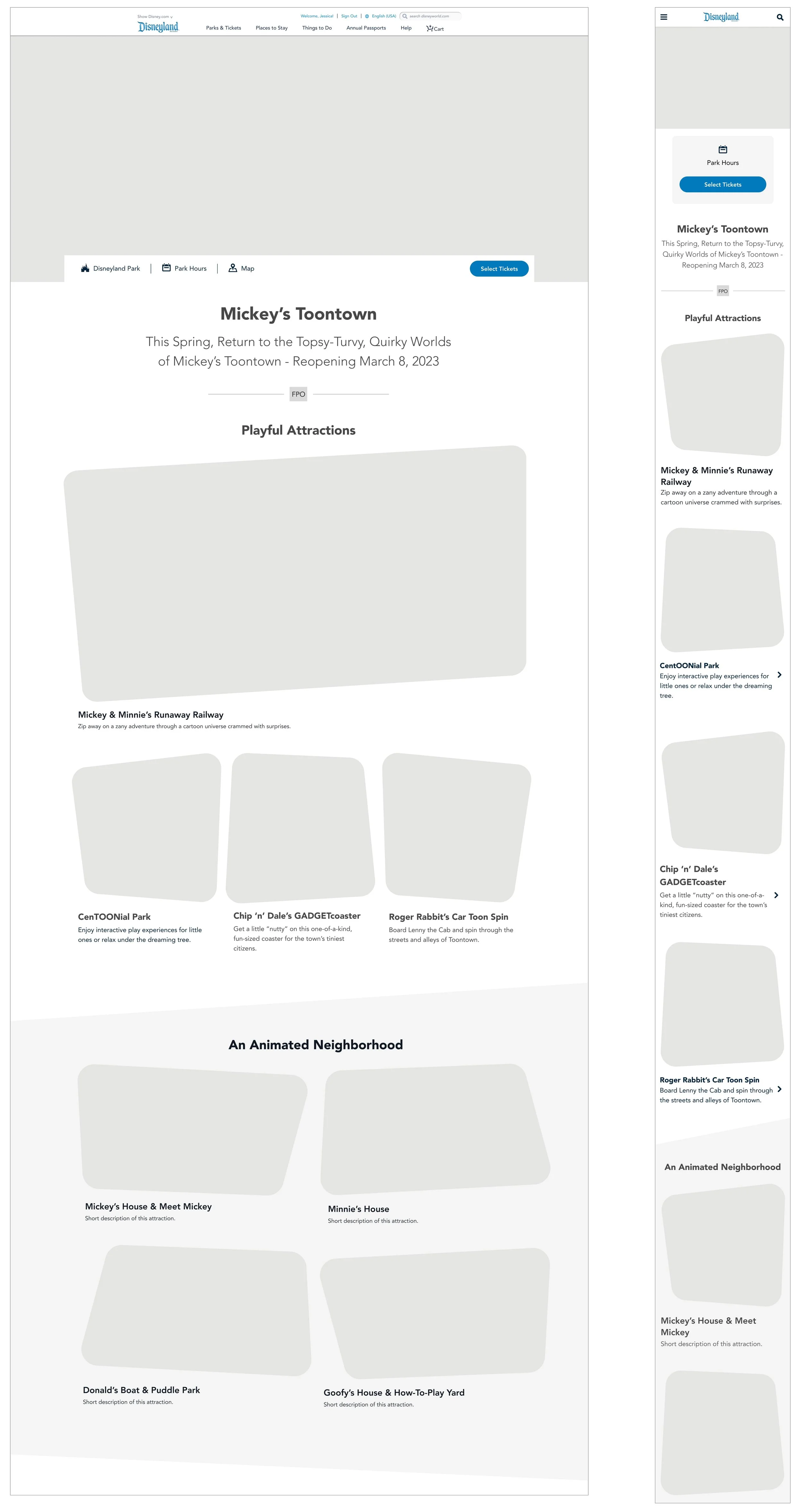
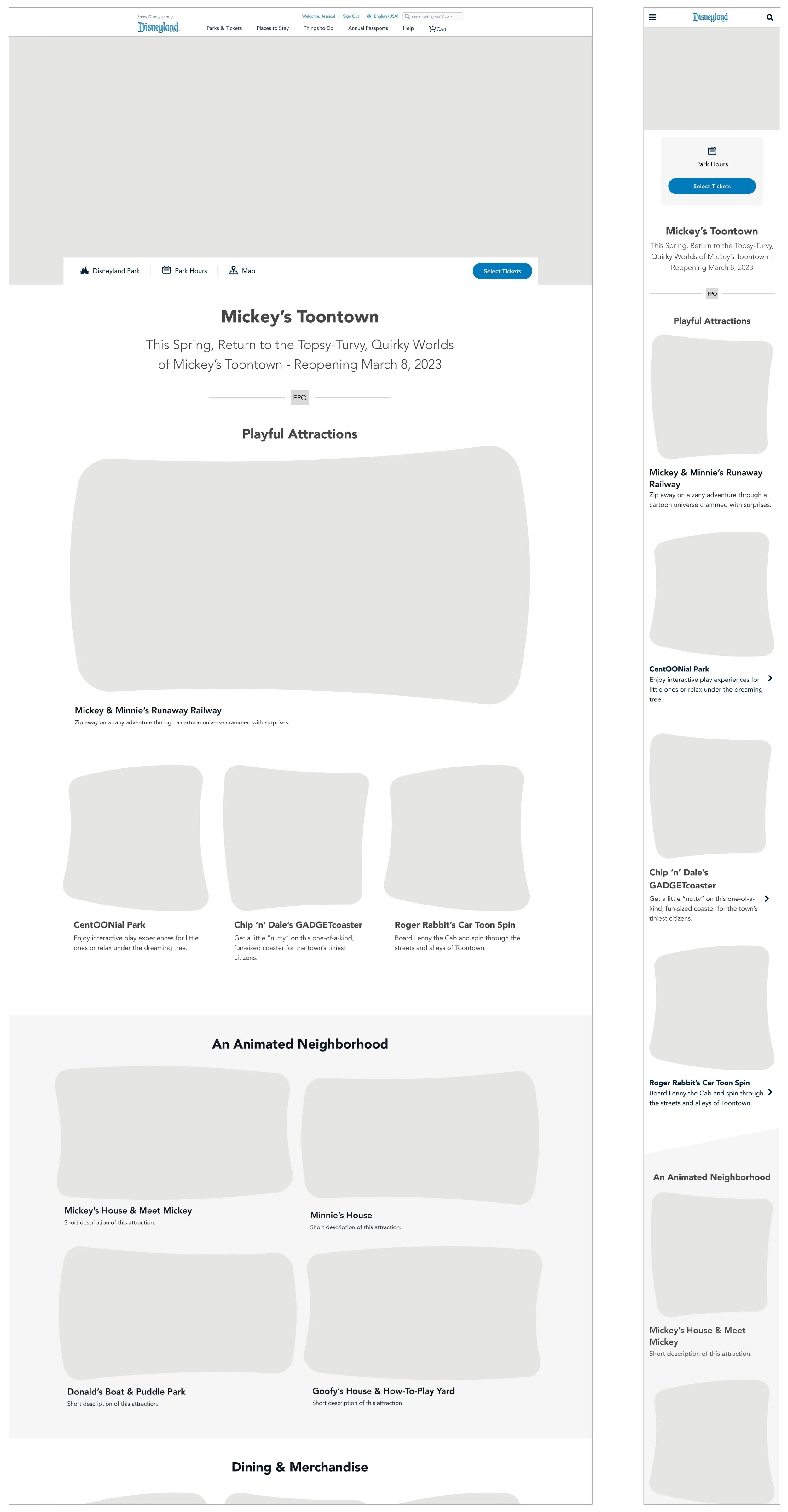
Wireframes
One way to convey the organized chaos of Toontown was to incorporate shapes into the layout. I experimented with uneven angles and squashed and stretched shapes that were similar to Toontown’s architecture.
Color Selection
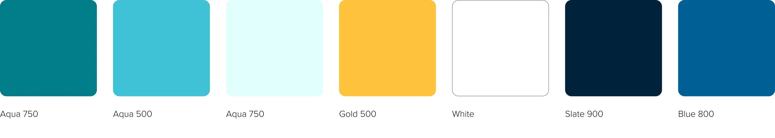
There was no digital style guide to draw from for this project, so I used the Toontown logo along with the images and renderings shown above as inspiration for creating a color scheme.


Accessibility
At this stage I also began testing potential color combinations for accessibility compliance. A small sampling of those results are below.


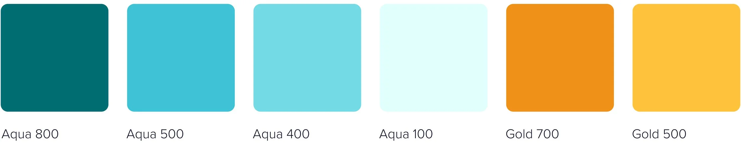
Final Color Palette for Web
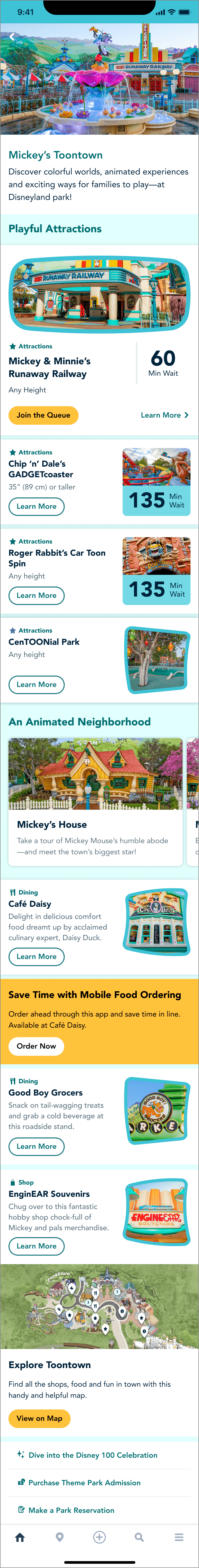
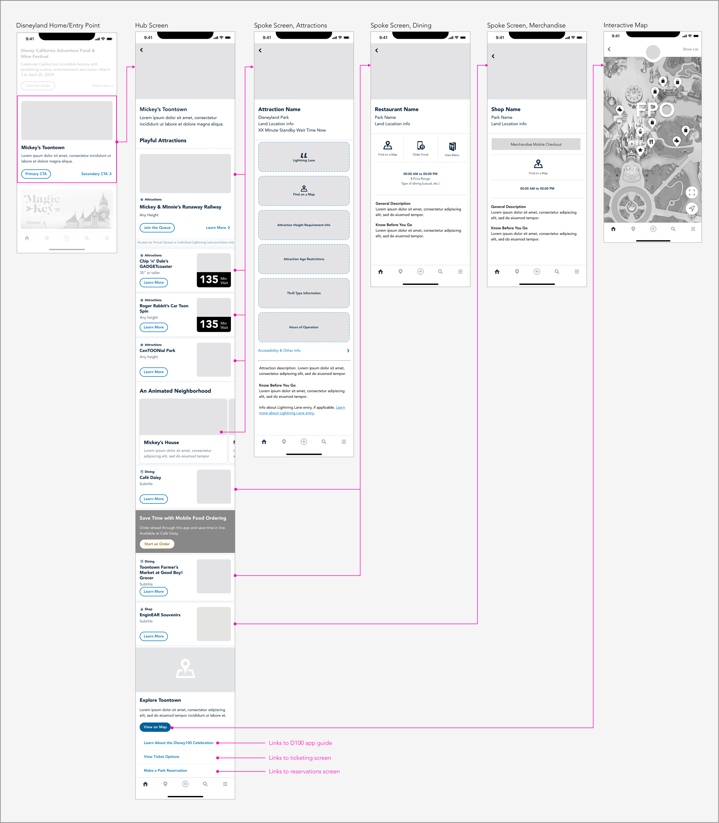
Wireframes for App
The screens below live within the Disneyland app and are meant to help guests manage and maximize their visit to Toontown. These screens also needed theming for brand consistency.
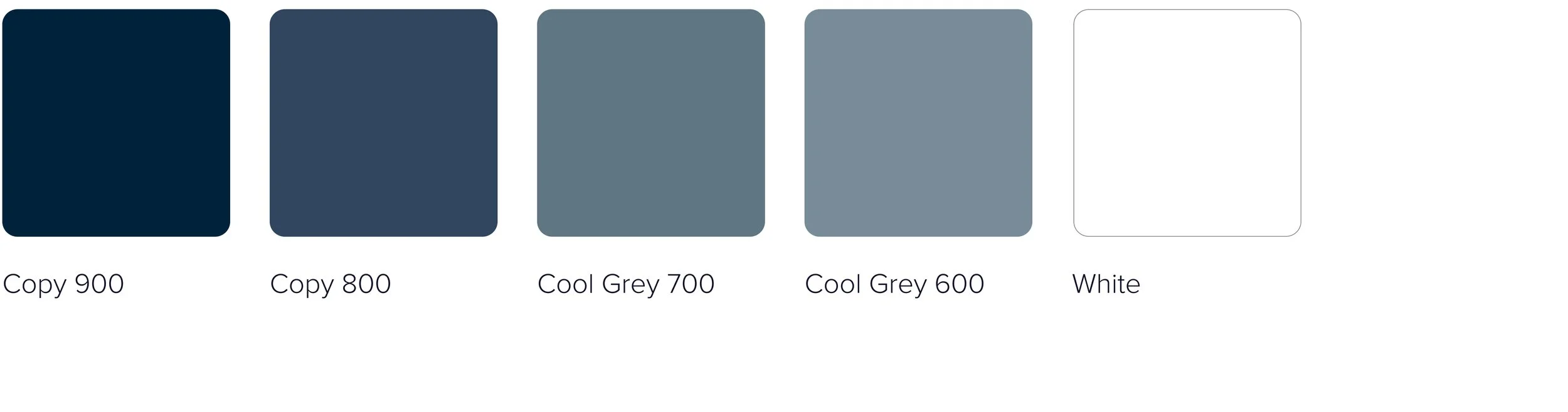
Final Color Palette for App
The app required few additional colors for elements that didn’t exist on web, like buttons, button active states, etc. Those are included below.
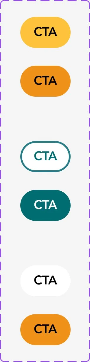
Interactive Components
Some app components and their variants are below. The pairs of buttons include the default and pressed states. The date picker is for web only.


Final Designs
You can view the pages live on Disneyland’s website. The app guide is currently available within the Disneyland app.